
Start with the text you want to use
Open Font Previewer and replace Hello with Make your mark. Keep the included collection and Featured first sorting. For this example, leave text size at 44 px, letter spacing at 0, line spacing at 1.3 and letter case at As typed. Use dark text (#202128) on white (#FFFFFF). The same settings make the comparison about the typefaces rather than different styling.
For your own project, use its actual name, headline or short message. Include an accent, number or punctuation mark that must appear in the finished design. The tool accepts up to 300 characters, but a short representative phrase is easier to compare at a glance.
Choose a varied shortlist
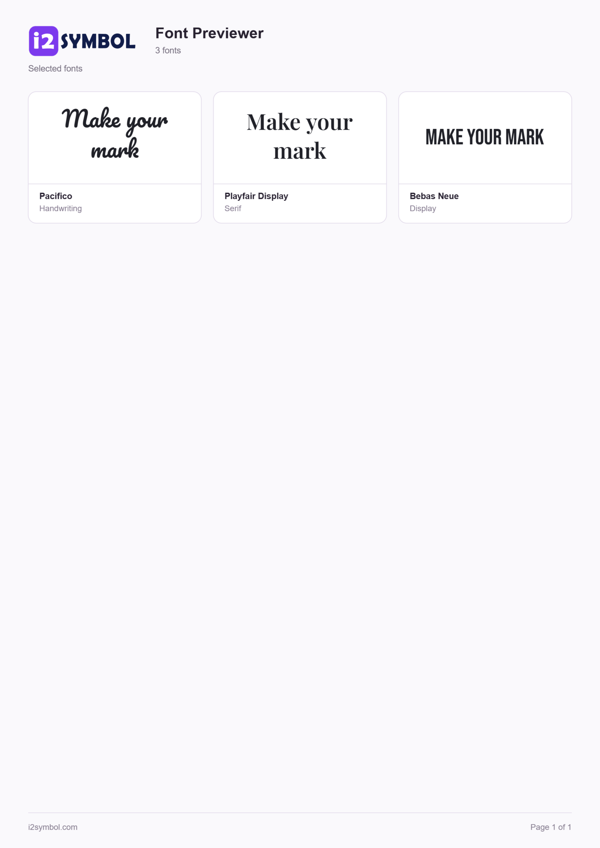
The first three featured cards are Pacifico, Playfair Display and Bebas Neue. Tick the checkbox beside each font name. These checkboxes create your PDF selection. Open Selected to inspect the three choices without the rest of the collection.
Pacifico gives this phrase a connected, handwritten feel. Playfair Display offers more formal serif shapes, and Bebas Neue uses compact uppercase letterforms. A font can display capitals even when your source uses lowercase; that is part of its design, rather than a change to your typed text.
For another comparison, search a font name or choose Handwriting, Serif, Sans serif, Display or Monospace from the style filter. Selections remain checked when you change searches. Select all matching also includes matching cards that have not yet appeared through Show more fonts.
Inspect the details that affect your design
Open Appearance to adjust size, letter spacing, line spacing or letter case across the cards together. Try Highlight letters with a letter that deserves a closer look, such as a. This marks matching text on screen in supported browsers and leaves your downloads unchanged. Return to the example settings before exporting if you want to reproduce the result shown here.
The Characters icon on a font card opens its actual Unicode character map. Search for an accent directly or enter a value such as U+2026 for an ellipsis. Click a character to insert it into the preview at the last cursor position. The map lists encoded characters, not stylistic alternates or optional ligature designs.
Compare is a different control from the selection checkboxes. Add two to four fonts with their Compare icons to open a focused side-by-side view. Use it for a close decision; use checkboxes when you want a larger report or a saved group.
Save the choices as a browser collection
Choose Save collection, enter Headline shortlist and confirm. Because three fonts are checked, the collection stores those references along with the preview text and appearance. If no fonts are checked, it stores all matching fonts instead.
Open collection lets you restore the group later. Collections stay in this browser and are not synchronized to an account. Clearing site data removes them. Installed fonts are remembered by reference, so you need those fonts on the device and must enable access again when reopening. Keep a separate PDF when you want a durable visual record.
Download the selected font cards as one PDF
In the export selector beside Download PDF, choose Selected. Click Download PDF. The tool loads the selected fonts and builds a report with the official i2Symbol wordmark, the font names and your styled phrase. With our three-font shortlist, the report is one A4 portrait page. You can cancel while a report is being prepared.
All matching is useful when you want the current filtered collection instead. It includes every match, not just the visible cards. The default 32-font collection fits across three pages with this short phrase. Longer text can use taller cards and a smaller common preview size so the complete text stays visible.
The PDF is a visual comparison sheet: its cards are rendered as images. It does not embed installable fonts or provide editable text. A font that cannot be loaded is reported rather than silently replaced for the whole card. Individual unsupported characters can still use the browser’s glyph fallback, so check important characters beforehand.
Create a PNG when you want to use one style
Tap the Pacifico text preview to open Make an image. Leave Transparent background enabled and choose Download PNG. This produces a separate text image that can be placed over a photo or another design. Turn transparency off when you want the selected background color included.
Copy image is available where the browser allows image clipboard access. Sharing the PNG preserves the visible lettering, while copying ordinary text does not carry a font with it. If you want to use the typeface inside another editor, obtain the font through its own licensed source.
Small choices that help
Compare the same words at the same size
Use consistent colors and spacing for the first pass. Then test the finalists at the actual size and background of your project.
Check a difficult letter before choosing
An accented surname or a symbol can expose a coverage gap that Hello does not. Characters helps confirm that the selected font contains the character.
Explore installed fonts on a supported computer
Load system fonts requests browser permission. My fonts shows the available families, and the same selection, character-map, PNG and PDF workflow applies.
Useful questions
Does the PDF include cards I have not opened with Show more?
Yes. All matching uses the full current collection and filters. Selected uses the fonts you checked, even when their cards are not currently visible.
Can I compare fonts without installing anything?
Yes. The included collection provides 32 openly licensed fonts in the browser. Optional access to already-installed fonts depends on desktop browser support and permission.
Are the fonts embedded in the PDF?
No. The font cards are rendered as images to preserve their browser appearance. The report is a visual reference, not a font installer or an editable text document.
Can I save the shortlist for another day?
Save collection keeps its font references and preview settings in the current browser. Clearing site data removes it, and installed fonts need to be enabled again. The downloaded PDF remains a separate file.
Why can an accent look different from the rest of the text?
The chosen font may not contain that character, causing a browser fallback. Open Characters to check the specific letter or symbol.